Blog

  • What risk are you actually taking?

    A plain-language guide to volatility, drawdowns and the risks a price chart does not show.

    An Etesia primer. Reading time: about 10 minutes.

    Picture two investments of 10,000. Ten years later, each is worth 15,000. On paper they earned the same return, but one of them lost half its value on the way.
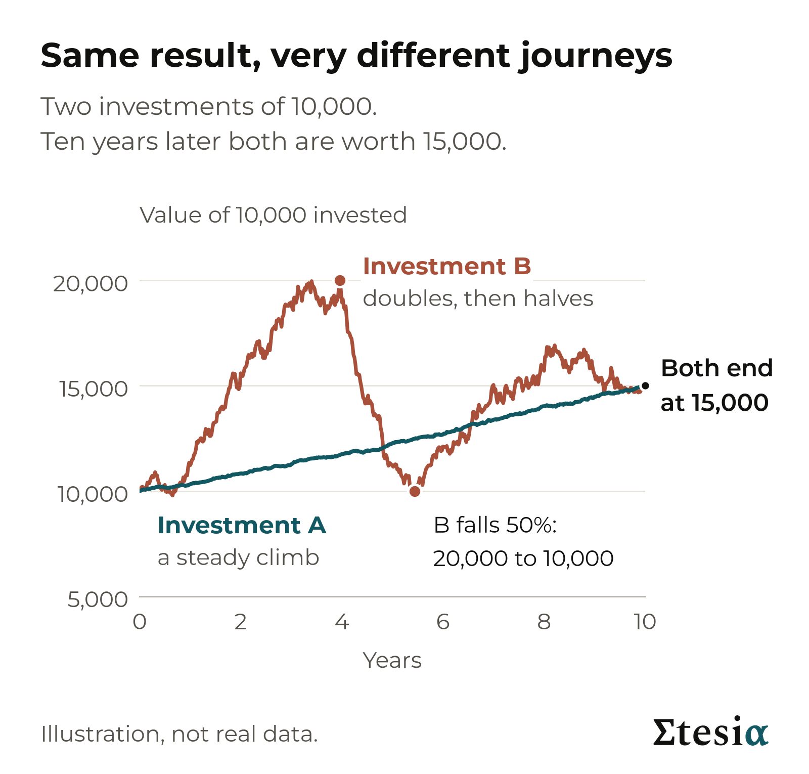
    Two illustrative investments of 10,000 that both end at 15,000 after ten years: one rises smoothly, the other doubles and then loses half its value on the way
    Same start, same finish, very different journeys. Illustration, not real data.

    The first climbed steadily. The second doubled, then fell by half, and climbed back unevenly. Had you held it, you would have watched 10,000 disappear in about eighteen months, with no way of knowing it would come back. That is the moment many people sell.

    Return tells you where you ended up. Risk tells you what you went through to get there. Most adverts talk about the first. This primer is about the second.

    Takeaway: two investments with the same return can be very different to live with.


    What risk is

    Risk is the chance that things turn out differently from what you expected. Above all, it is the chance of losing money you cannot afford to lose.

    Any return above what a savings account offers is a payment for carrying some uncertainty. The reverse does not hold: taking a risk does not guarantee a return, and some risks (fraud, a failed platform, a software bug) pay nothing at all.

    So the useful question is not “is this risky?” It is “which risk, how much of it, and what am I paid for it?”

    Some risk shows on a price chart and some does not. We start with what shows.

    Takeaway: return above a savings rate always comes with risk, but risk does not always come with return. Know which risks you hold.


    Volatility: how bumpy the ride is

    Volatility measures how much the value of an investment moves up and down along the way. It is quoted as a percentage per year: the typical size of a year’s swing, up or down.
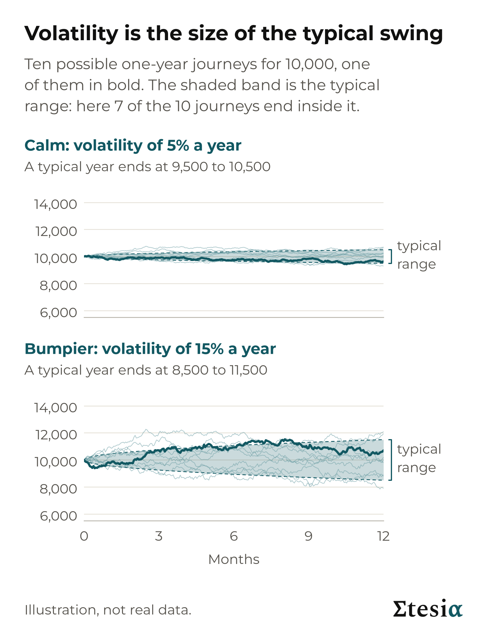
    Two panels of ten illustrative one-year paths each, one calm at 5% volatility and one bumpier at 15%, with a shaded band showing the typical range
    Volatility is the width of the band, not the direction of the line. Illustration, not real data.

    A rule of thumb: put 10,000 into something with a volatility of 15%. In about seven years out of ten it ends the year between 8,500 and 11,500, before counting any growth. In the other three it lands outside, and real markets produce extreme years more often than the rule suggests. The range describes the past, not a limit.
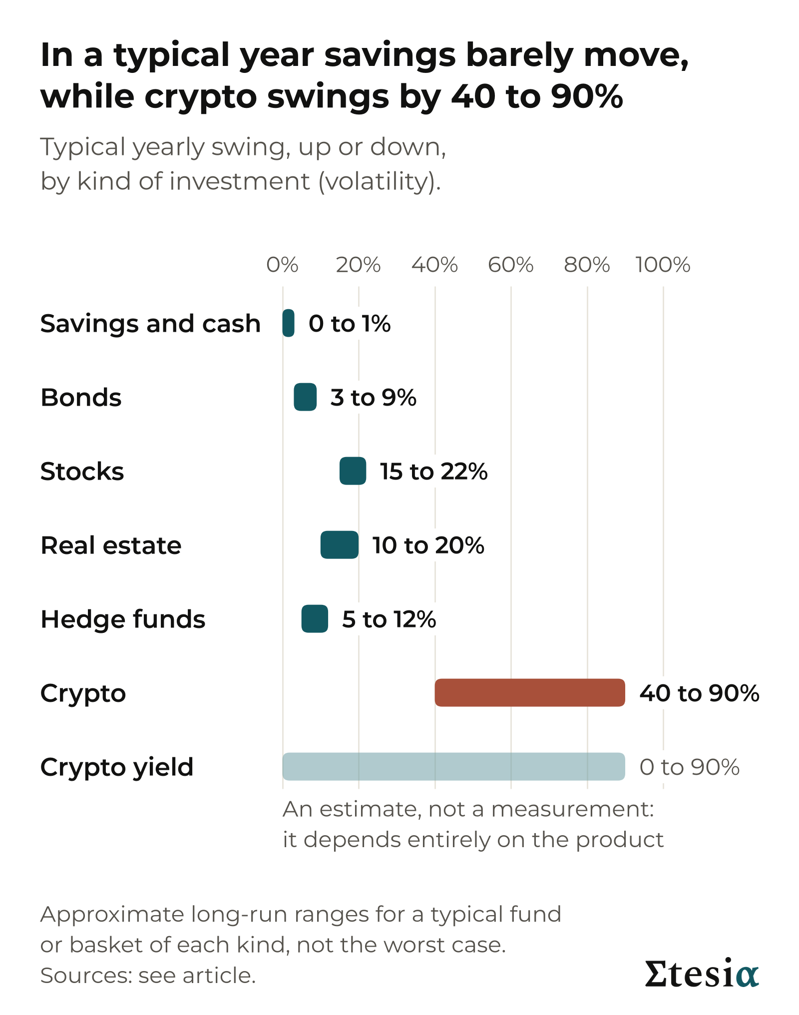
    Horizontal bars showing the typical yearly volatility range of seven investment types, from savings to crypto
    Typical yearly volatility by investment type. Approximate long-run ranges.

    The spread is wide: from 1% or less for savings to 40 to 90% for crypto.

    Volatility misses three things. It counts a swing up like a swing down, though only one hurts. It describes a typical year, not the worst one. And it only sees what shows in the price. A building is not priced every day: an expert values it from time to time, so on paper it looks calm. Between September 2008 and February 2009, US property measured that way fell 15%. Property funds traded daily on the stock market, which also carry debt, fell 60%.

    Takeaway: volatility tells you how rough a normal year is, not how bad a bad year can get.


    Drawdown: the number you actually feel

    A drawdown is the fall from a high point to the low that follows, and the maximum drawdown is the deepest one in an investment’s history. Two things matter: how deep the fall is, and how long you wait to see your old high again, known as time under water.
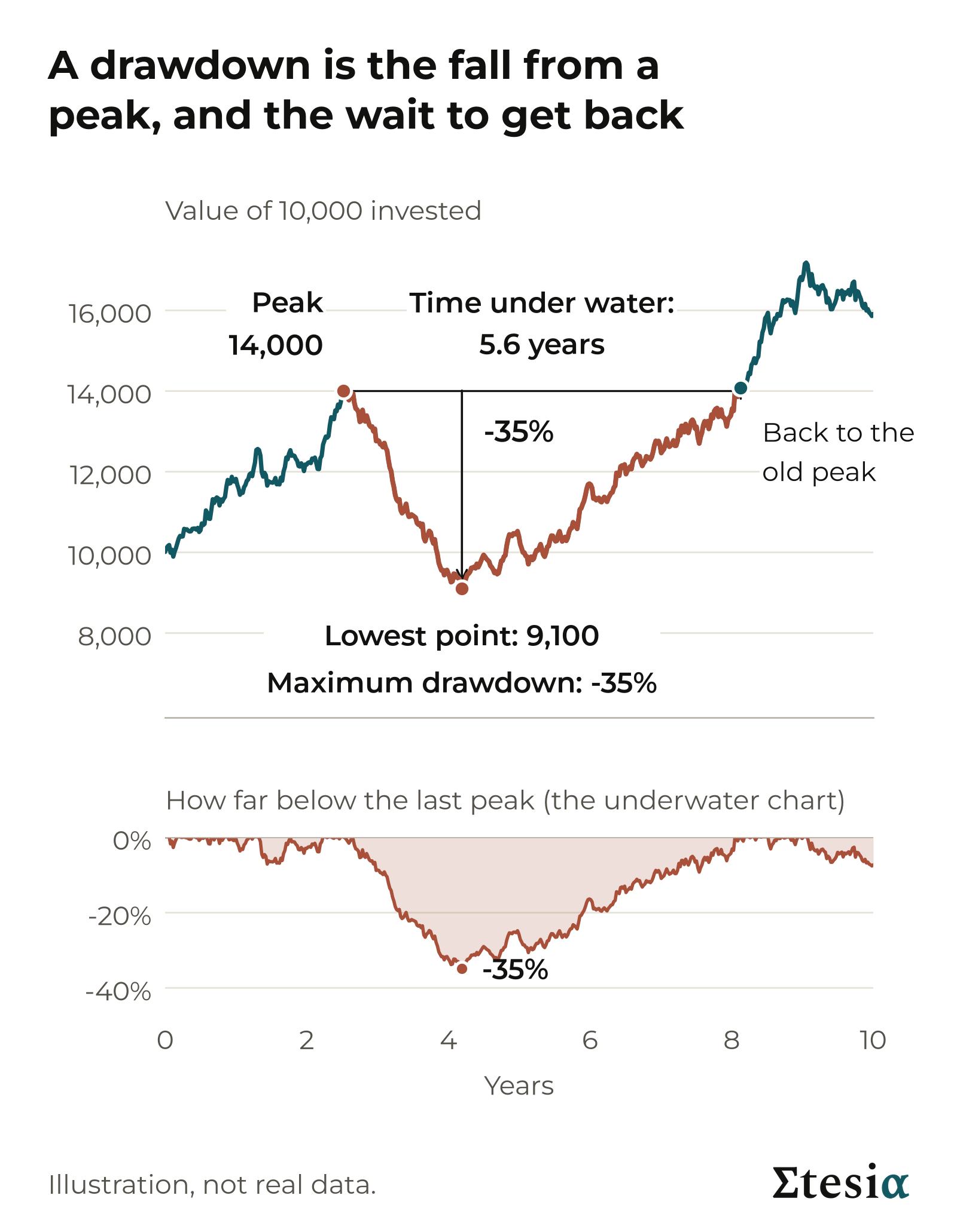
    An illustrative price path marking the peak, the trough, the maximum drawdown and the recovery time, with an underwater panel beneath
    Anatomy of a drawdown: depth, and time spent under water. Illustration, not real data.

    Your 10,000 falls to 8,000: a 20% drawdown. To get back you must earn 2,000 on the 8,000 you have left: a gain of 25%, not 20%. The climb is always steeper than the fall, because it starts from a smaller sum. Lose 50% and you need 100%: your money has to double. Lose 80% and you need 400%.
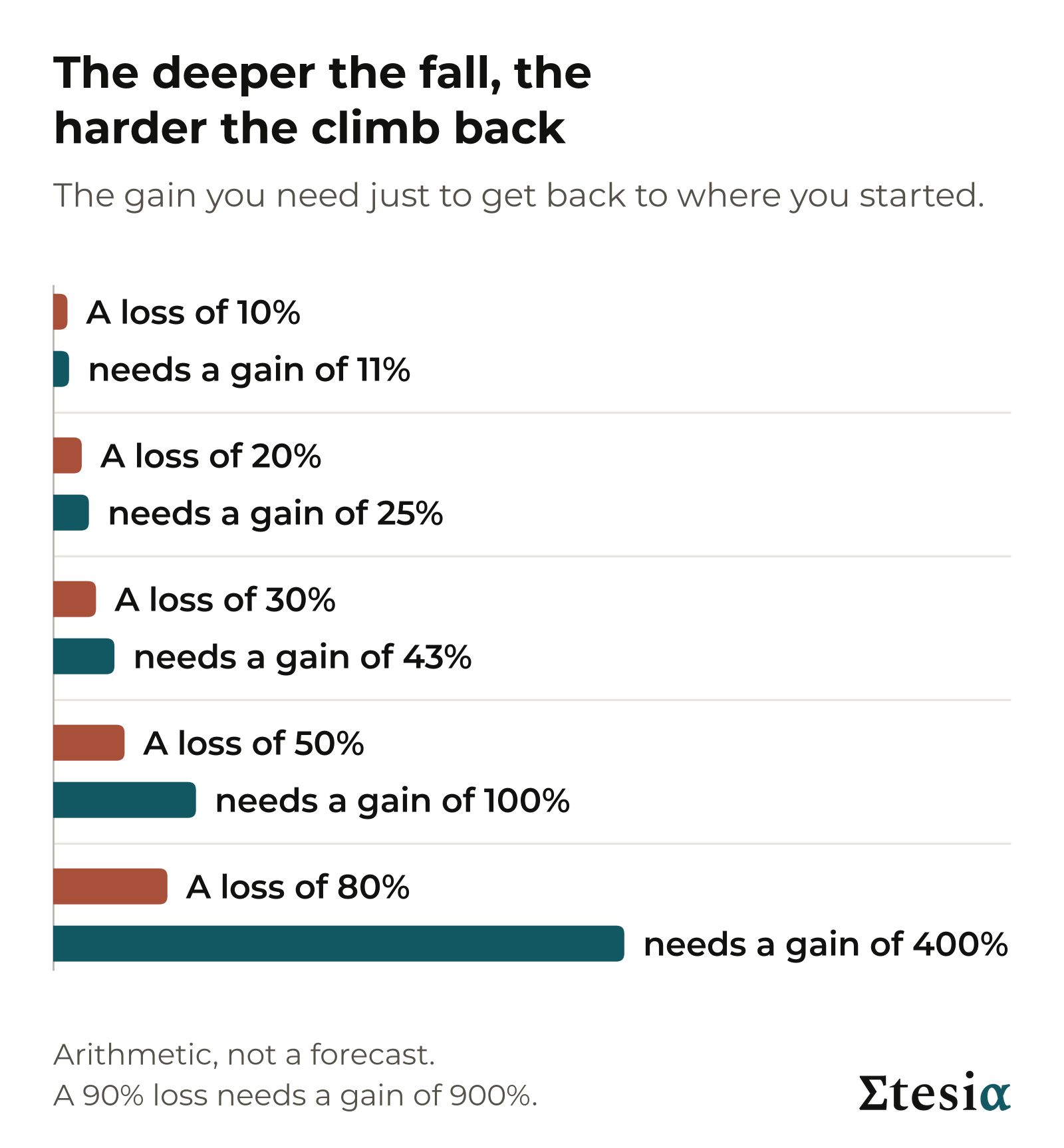
    Bar chart of the gain needed to recover from a loss: 10% needs 11%, 20% needs 25%, 50% needs 100%, 80% needs 400%
    The deeper the fall, the steeper the climb back.

    The wait can be long. The S&P 500, an index of 500 large US companies (an index tracks the average price of a group of investments), fell about 57% between October 2007 and March 2009. On prices alone, it took about five and a half years from its peak to get back.

    Drawdown is the number people feel, because it is measured in money they once had. Selling at the low makes the loss permanent. But holding on is not a guarantee either: some investments take many years to come back, and some never do.

    Takeaway: ask how deep an investment has fallen and how long it stayed down.


    The risks you cannot see on a price chart

    Most of the risks below can sit behind a chart that still looks calm.
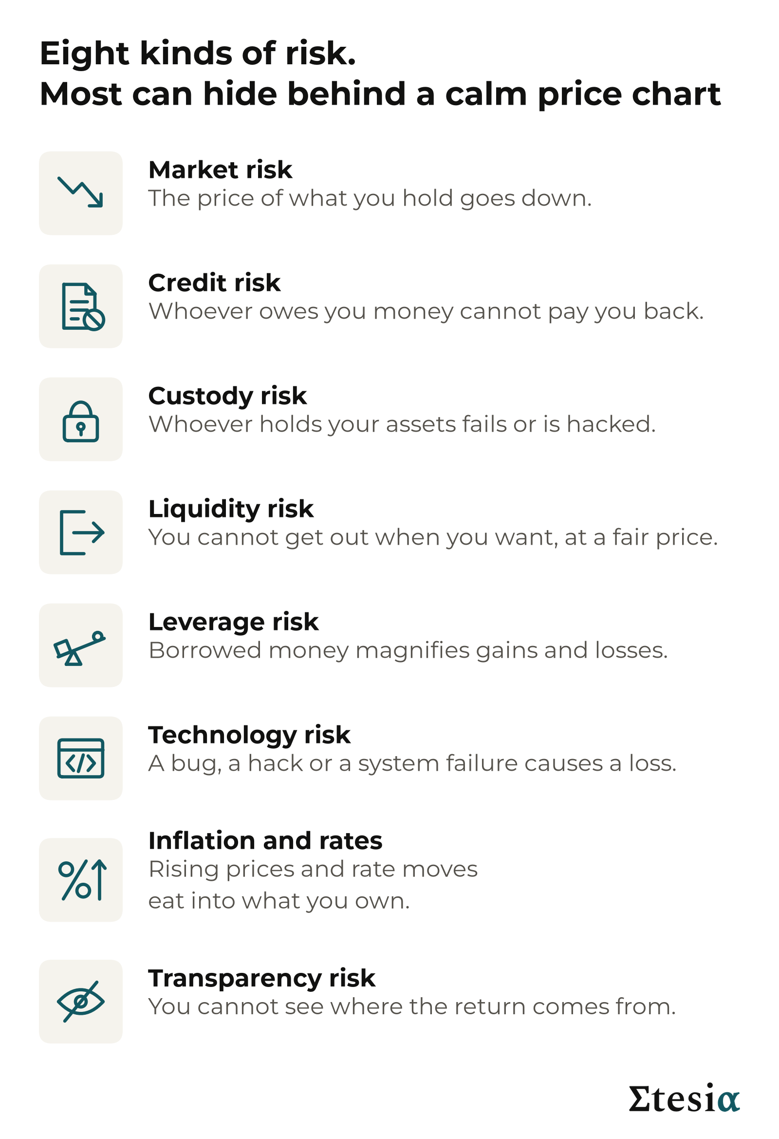
    Icon list of the eight risk types: market, credit, custody, liquidity, leverage, technology, inflation and rates, transparency
    Eight kinds of risk. Most investments carry several at once.
    • Market risk. The price of what you hold goes down, sometimes for years. Bitcoin fell 77% between November 2021 and November 2022.
    • Credit risk. Whoever owes you money cannot pay. A money market fund is used much like a savings account, and each share is meant to stay worth exactly $1.00. In September 2008 a large US one, the Reserve Primary Fund, held debt of Lehman Brothers, an investment bank that failed. The share value slipped to $0.97 and withdrawals were frozen.
    • Custody risk. Someone else holds your assets, and they could fail, be hacked or misuse them. FTX, a crypto exchange (a platform for buying, selling and storing coins), went bankrupt in November 2022 after customer money was taken and used by a related trading firm. Most customers waited more than two years to be repaid.
    • Liquidity risk. You cannot sell or withdraw when you want, or only at a much worse price. After the UK’s 2016 vote to leave the EU, six property funds holding about £14.6 billion suspended withdrawals: buildings cannot be sold in a day.
    • Leverage risk. Leverage means investing with borrowed money. Put in 1,000 of your own and borrow 1,000 more. If what you bought falls 10%, you have lost 200, which is 20% of your own money.
    • Technology risk. Bugs or hacks cause losses that have nothing to do with markets. In March 2023 an attacker found a flaw in Euler, a crypto lending service run by computer code, and took about $197 million. In that case the funds were later returned.
    • Inflation and rates. Rising prices shrink what your money buys, like a slow puncture. When interest rates rise, new bonds pay more, so older bonds that pay less become worth less. US inflation reached 9.1% in June 2022, interest rates rose fast, and a broad US bond index lost 13% that year.
    • Transparency risk. You cannot see where the return comes from, who is in charge, or which rules protect you. Bernard Madoff reported smooth, steady gains for decades. The trades were invented, and so was most of the $64.8 billion shown on client statements.

    Takeaway: a smooth chart is not proof of low risk.


    A tour of seven kinds of investment
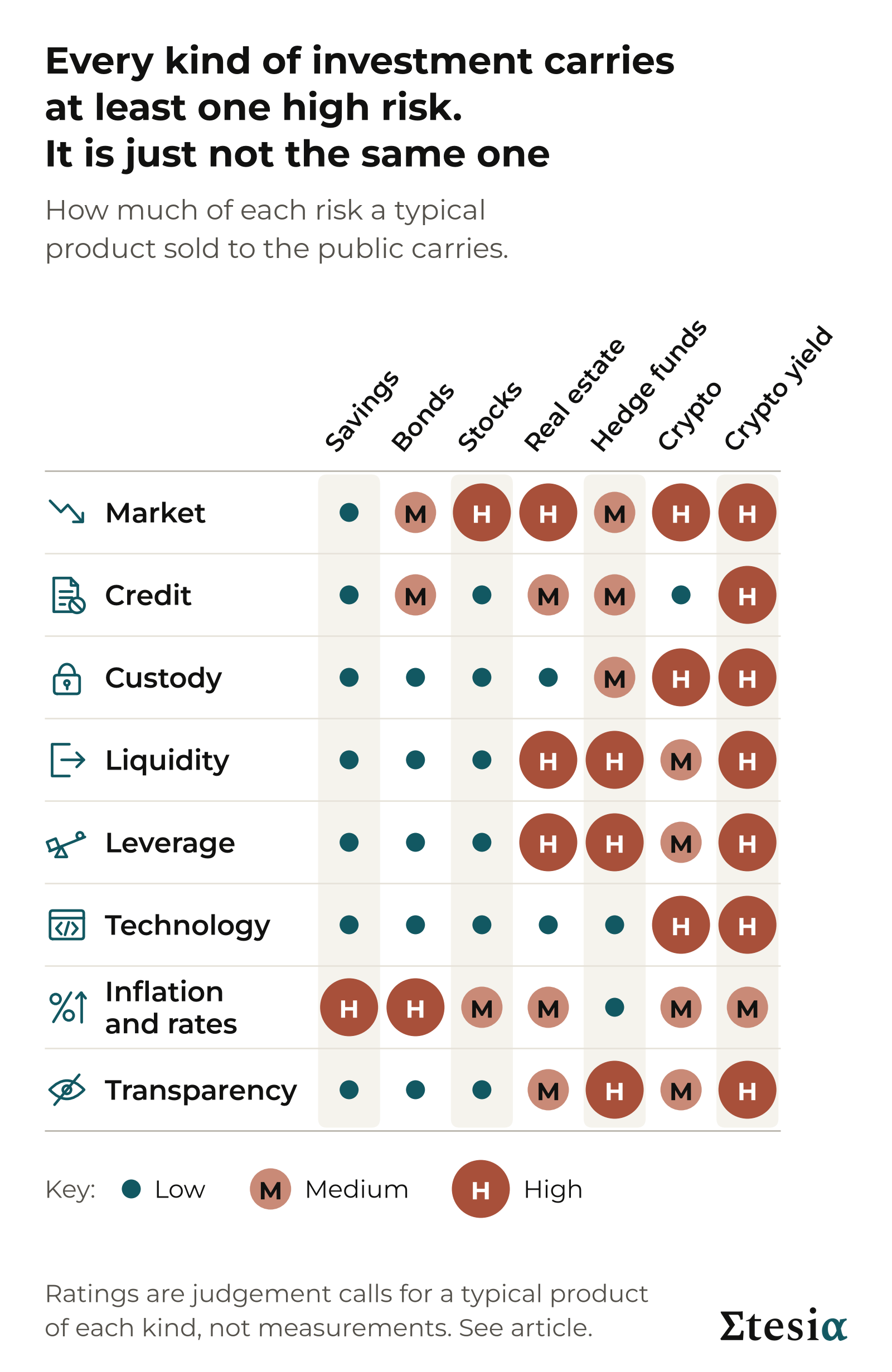
    Matrix of seven investment types against eight risk types, each cell rated low, medium or high by dot size and colour
    Which risks each investment carries. The ratings are judgements for a typical product of each kind, not measurements.

    Savings and cash. The bank pays interest because it lends your money on. If it fails, a national guarantee scheme covers deposits up to a limit (€100,000 in the EU, £120,000 in the UK, $250,000 in the US). Money market funds have no such guarantee: the one in the credit example lost 3%. The quiet risk is inflation, when prices rise faster than your interest.

    Bonds. You lend to a government or a company, which pays interest and, unless it fails, returns the loan at the end. A broad bond fund can lose more than 10% when interest rates rise fast.

    Stocks. You own a slice of real companies and share in their profits. A bad year can cost a quarter to a third of your money, and twice since 2000 the main US index has roughly halved.

    Real estate. Tenants pay rent and buildings may rise in value. Property is usually bought with borrowed money and is slow to sell, so losses are magnified and you may be unable to get out.

    Hedge funds. A manager trades your money, often with borrowed money, and keeps part of the gains as fees. Funds differ enormously, strategies are often undisclosed and money can be locked in for a year or more.

    Crypto. No interest, rent or profit stands behind a coin: you gain only if someone later pays more than you did. The price can rise or fall by half in an ordinary year, and Bitcoin has lost roughly 75 to 85% of its value three times since 2013.

    Crypto yield. Lending platforms, staking (locking up coins to help run a network) and products built on stablecoins (coins meant to stay worth one dollar) can pay a yield: a regular income, quoted as a percentage per year. It comes from borrowers, from rewards paid by the network or from newly created coins handed out as a bonus, and it is not always clear which.
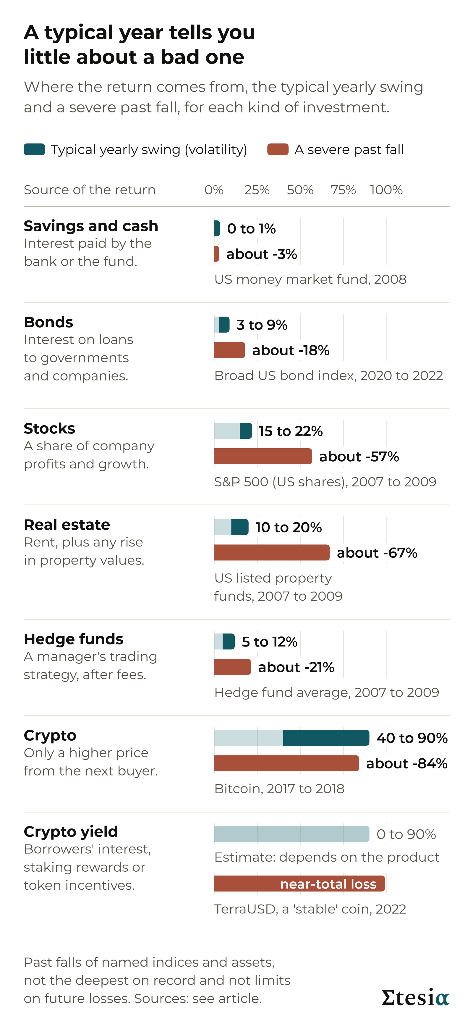
    Per investment type: where the return comes from, the typical yearly volatility and a severe past fall
    What to expect from each type, in ordinary and in bad times. Every fall shown is a past episode, not a limit on future losses.

    These falls are reference episodes, not the deepest on record: US shares fell 86% between 1929 and 1932, Bitcoin fell by more than 90% in 2011, and single shares, funds and coins have gone to zero.

    Takeaway: each investment swaps one set of risks for another. None is risk-free.


    Yield is never free

    A yield above the savings rate is a payment for carrying a risk. The higher the figure, the harder you should look for the risk behind it.

    A product called Anchor advertised up to 20% interest on TerraUSD, a stablecoin. In May 2022 the coin and its sister coin fell to close to zero, and at least $40 billion of market value was lost. The lending platform Celsius advertised up to 18%, froze withdrawals in June 2022 and went bankrupt a month later, owing customers about $4.7 billion.

    In both cases calm prices gave no warning. The risk was in how the product worked and what was done with the money.

    Takeaway: if you cannot name the risk behind a yield, you are still carrying it.


    Five questions before you invest
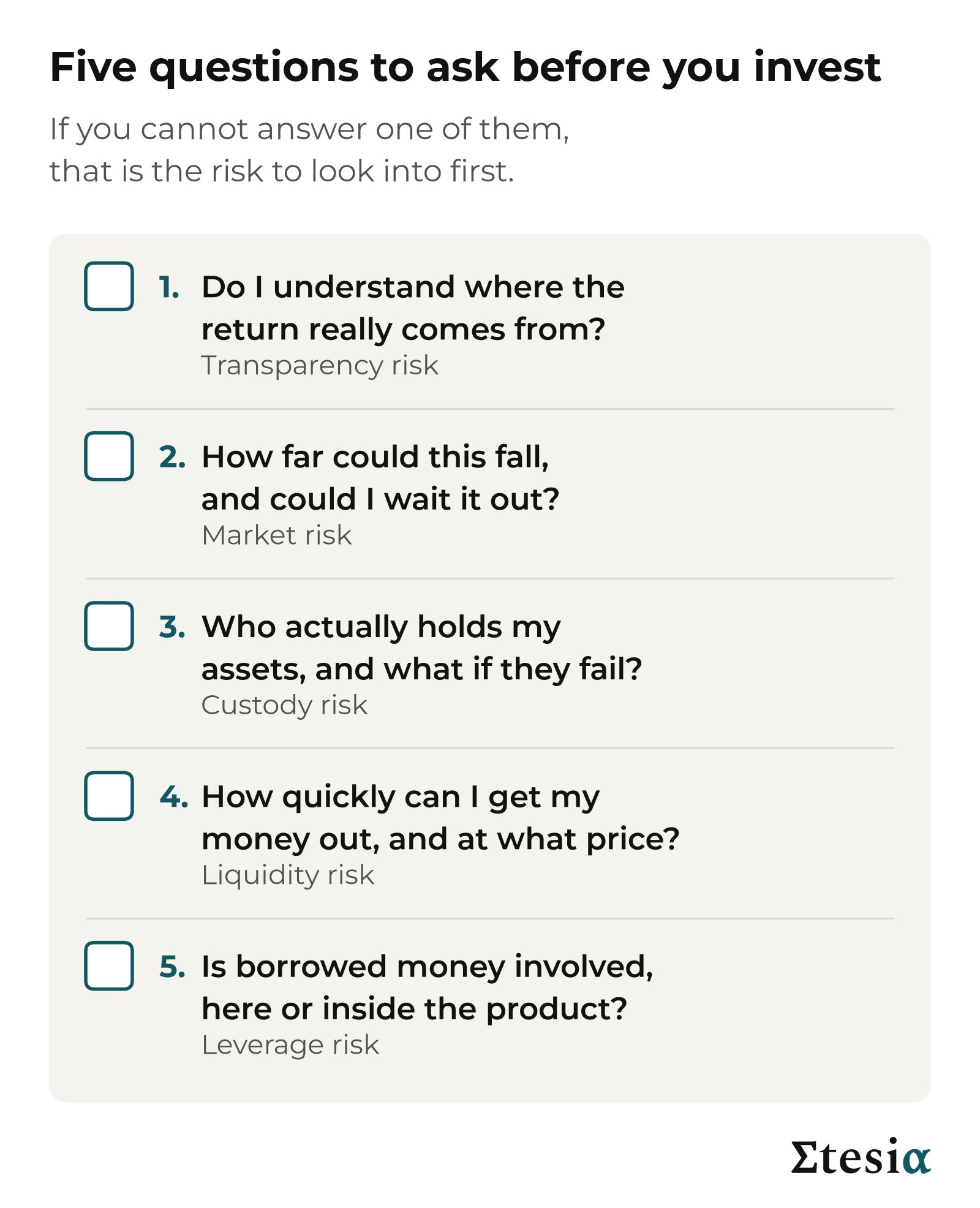
    Checklist card with five questions to ask before investing
    Five questions that cover most of what can go wrong.
    1. Do I understand where the return really comes from?
    2. How far could this fall, and could I wait it out?
    3. Who actually holds my assets, and what if they fail?
    4. How quickly can I get my money out, and at what price?
    5. Is borrowed money involved, here or inside the product?

    A clear answer to each does not make an investment right for you. A missing answer is a warning.

    Takeaway: you do not need a formula to assess risk. You need five answers.


    How Etesia thinks about risk

    Etesia runs trading strategies that follow fixed rules. Client assets sit in on-chain vaults: pools held by computer code on a public blockchain (a shared record that anyone can inspect), not in an account at Etesia.

    We set the risk first, as two numbers.

    The first is volatility. Today we target 15% a year, the bottom of the range for stocks on the chart of yearly swings above. That describes the size of the swings we aim for, not the kind of risk.

    The second is drawdown. We calibrate our risk so that drawdowns are designed to stay within 15%, a fall that needs a gain of about 18% to recover.

    Both are targets the system is built around, not guarantees. A real fall can go beyond its target, so we watch drawdown continuously.

    On questions 3 and 5: the vault holds the assets, so Etesia does not. We can trade them under strict limits but never withdraw them. That changes the custody question without removing it: you rely on the vault’s code and on the trading venue. The strategies trade derivatives (contracts that follow an asset’s price), which work like investing with borrowed money, so leverage is part of the product.

    Rated the same way as the risk map, in our own judgement, the vaults are high for technology, medium for market, credit, custody and leverage, and low for liquidity (you can withdraw at any time), for inflation and rates, and for transparency (deposits, trades and withdrawals are public on the blockchain).

    Takeaway: a risk target is a statement of intent, not a promise.

    Before you put money into anything, ours included, put the five questions to it. If an answer is missing, keep asking until you have it.


    Next in this series: how to compare return with risk, using a measure called the Sharpe ratio.

    Sources

    The figures in this article come from public sources: regulators, central banks, index providers, court records and, for crypto prices, the trade press. The main ones are listed here.

    • Volatility ranges: J.P. Morgan Asset Management, 2026 Long-Term Capital Market Assumptions. The two crypto ranges are Etesia’s judgement, informed by figures from Fidelity Digital Assets and 21Shares.
    • Stocks: Yardeni Research, tables of S&P 500 rises and falls.
    • Bonds: the Bloomberg US Aggregate Bond Index, as reported by Bloomberg and Morningstar.
    • Property: the FTSE Nareit All Equity REITs Index (US property funds traded on the stock market); Sun, Titman and Twite, 2013 (published by Nareit); UK Financial Conduct Authority, discussion paper DP17/1.
    • Hedge funds: Hedge Fund Research, HFRI Fund Weighted Composite Index (an industry average); court filings as summarised by Wikipedia, and the trustee’s reports (Madoff).
    • Savings: FSCS, European Central Bank and FDIC (deposit guarantee limits); US Securities and Exchange Commission and US court documents (Reserve Primary Fund); US Bureau of Labor Statistics (inflation).
    • Crypto: Cointelegraph and 24/7 Wall St. (Bitcoin prices); US Securities and Exchange Commission (TerraUSD); Chainalysis (Euler); CNBC, Fortune and US regulators (Celsius); Reuters and the US Department of Justice (FTX).

    The ratings on the risk map are Etesia’s own judgement, not measurements.

    This article is general educational content, written as of October 2026. It is not investment advice, not a personal recommendation, and not an offer or invitation to invest in any product, including Etesia’s vaults. Etesia runs investment strategies and so has a commercial interest in this subject. All investing involves risk, including the loss of everything you invest. Crypto-related products are high risk and are usually not covered by deposit insurance or investor compensation schemes. The risk ratings are Etesia’s judgements, not measurements. Historical figures are approximate and past performance is not indicative of future results. Etesia’s volatility and drawdown figures are design targets, not results and not guarantees.
  • Trend Following – Systematic Macro Trading

    Not an investment advice – ACADEMIC PURPOSE ONLY

    Why trade trend following, and why on crypto and RWA

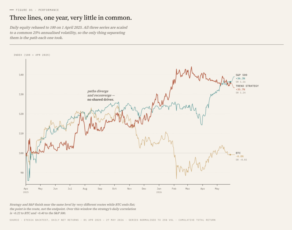
    Over the simulated year from April 2025 to April 2026, our trend-following strategy returned 35.3% net with a 1.26 Sharpe ratio, while exhibiting a correlation of -0.22 to Bitcoin and -0.40 to the S&P 500. At equivalent volatility over the same window, BTC buy-and-hold produced a Sharpe of -0.03 and the S&P 500 produced 1.16.

    The interesting number is not the return. It is the correlation.

    This is the first article in a series introducing Etesia and the strategies we run. We start with trend following because it is the first strategy we have launched and the easiest to explain. Later articles will unpack Sharpe ratio, volatility targeting, and the other pillars of the platform.

    What is trend following?

    Trend following is a systematic strategy that takes long positions in markets that have been rising and short positions in markets that have been falling. The signal is mechanical, derived from past prices alone, and the rules are the same across every instrument the strategy trades.

    A trend follower has no opinion on whether Bitcoin is overvalued, or whether gold should rise on inflation fears. It looks at price history, measures the strength and direction of recent moves, sizes a position to a target risk, and waits. When the trend reverses, the position flips. There is no narrative, no forecast, no view.

    This style is often called CTA, for Commodity Trading Advisor, the regulatory label given to firms that have run this approach in futures markets since the 1970s. Names like AHL, Winton, Aspect, Man and Campbell have managed tens of billions in CTA capital for decades. We apply the same framework to a different universe: crypto perpetual swaps and tokenised real-world assets.

    How the signal works

    The raw material is price, and the question is simple: is this market moving, and in which direction?

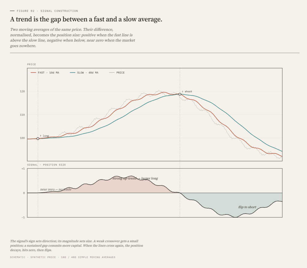
    The standard way to answer it is to compare two moving averages of the price, one fast and one slow. The fast average tracks recent price closely; the slow average lags. The gap between them is a single number that moves around zero:

    – Fast above slow: recent prices sit above older prices. The signal is positive, the market is trending up.

    – Fast below slow: the signal is negative, the market is trending down.

    – The distance from zero measures trend strength. Near zero means no trend, just noise.

    The magnitude does more than give direction; it sets the size of the position. A young, weak trend gets a small position. As the trend persists and the signal grows, the position is scaled up. The strategy commits the most capital to the trends that have proven themselves, and return accumulates for as long as the move lasts. It never has to call the top or the bottom; it needs the move, once underway, to outlast the noise.

    When the trend turns, the signal decays toward zero and the position is trimmed. When it crosses zero, the position flips, long to short or short to long. This is the built-in risk control: the signal is its own stop-loss. A position that stops working is cut automatically, and reversed if the move continues against it. Losers are closed by construction; winners are held for as long as the trend runs.

    In practice we combine several signals at different speeds, so the strategy responds both to fast multi-day moves and slow multi-month ones. The principle does not change.

    How it captures alpha

    The result is a characteristic payoff. Most trades are small losses: a signal forms, the trend fails to materialise, the position closes near where it opened. A minority are large gains: a market that trends for weeks or months, with the position scaled up and held the whole way. The few large wins more than cover the many small losses.

    This is how trend following captures alpha. Not by forecasting, but by harvesting the moves that persist while bleeding small amounts on those that do not. Why persistent moves exist at all is the subject of the next section.

    Takeaway: trend following reads direction and strength from price, scales into trends that prove themselves, and flips when they reverse. The signal is its own stop-loss, which gives the strategy its many-small-losses, few-large-wins payoff.

    Why it works

    The honest answer is that nobody fully knows. The useful answer is that several reinforcing effects, each modest on its own, combine into a persistent edge.

    Slow information diffusion. News and changes in fundamentals do not instantly translate into prices. Different investors update their views at different speeds. As information spreads from informed traders to less informed ones, prices drift in the direction of the new information, producing autocorrelation in returns at multi-week to multi-month horizons.

    **Herding and momentum chasing. Investors react to other investors. A move that starts on fundamentals attracts trend chasers, who push the move further, attracting more chasers. This produces overshooting and eventual reversal, but the overshooting phase is exactly what trend following captures.

    Risk transfer. Some market participants must trade for reasons other than expected return: hedgers, rebalancers, forced sellers in stress. Their flows are predictable in direction and create persistent pressure that systematic strategies can take the other side of.

    Behavioural anchoring. Investors anchor on recent prices, then update slowly. This delays the price response to genuinely new information and stretches moves over time.

    There is a fifty-year academic literature on time-series momentum that documents the effect across more than a hundred markets and back to the 19th century. Moskowitz, Ooi and Pedersen (2012) is the standard reference. The effect is not a quirk of one decade or one asset class.

    Why this should work especially well in crypto and RWA perpetuals

    Crypto markets are younger, more retail-driven, and less crowded with systematic capital than developed equity or rates markets. Narratives drive sustained flows: an ETF approval, a chain upgrade, a regulatory shift, a meme cycle. Information diffuses slowly because the participant base is fragmented across geographies, time zones and platforms. Forced flows from leverage liquidations and scheduled token unlocks are large relative to genuine investment flows. Each of the mechanisms above is more pronounced in crypto than in mature asset classes.

    Tokenised RWA add a second layer. Perpetual swaps on metals, energy and equity indices trade 24/7 and respond to global flows, but the underlying assets are driven by macro factors that are independent of crypto. The same trend-following rules, applied to a gold perpetual and to an ETH perpetual, produce signals that move independently of each other.

    Takeaway: the economic case for trend following is well documented across decades and asset classes. The case is structurally stronger in crypto and tokenised RWA than in developed markets.

    Why it diversifies

    This is the part that matters most for anyone already holding crypto, equities or gold.

    A trend-following strategy has, by construction, no permanent long bias. It will be long in rising markets and short in falling ones. Over time, its returns depend on whether trends exist, not on whether markets go up. That makes it structurally different from buy-and-hold.

    In a stress event, this matters. The 2008 crisis, the 2018 crypto winter, the March 2020 crash, the 2022 bear market: in each, buy-and-hold equity and buy-and-hold crypto fell together. Trend-following CTAs, in aggregate, were flat to positive across most of these episodes, because by the time the crash matured they had flipped short on the assets that were falling.

    In our backtest, the realised correlations are -0.22 to BTC and -0.40 to the S&P 500. That is not a coincidence and it is not engineered through optimisation. It is a property of any strategy that responds symmetrically to up and down moves, applied to a universe where directional persistence exists.

    For an investor whose portfolio is concentrated in BTC, ETH, equities, gold, or some mix of these, adding an uncorrelated strategy with a similar Sharpe materially improves portfolio efficiency.

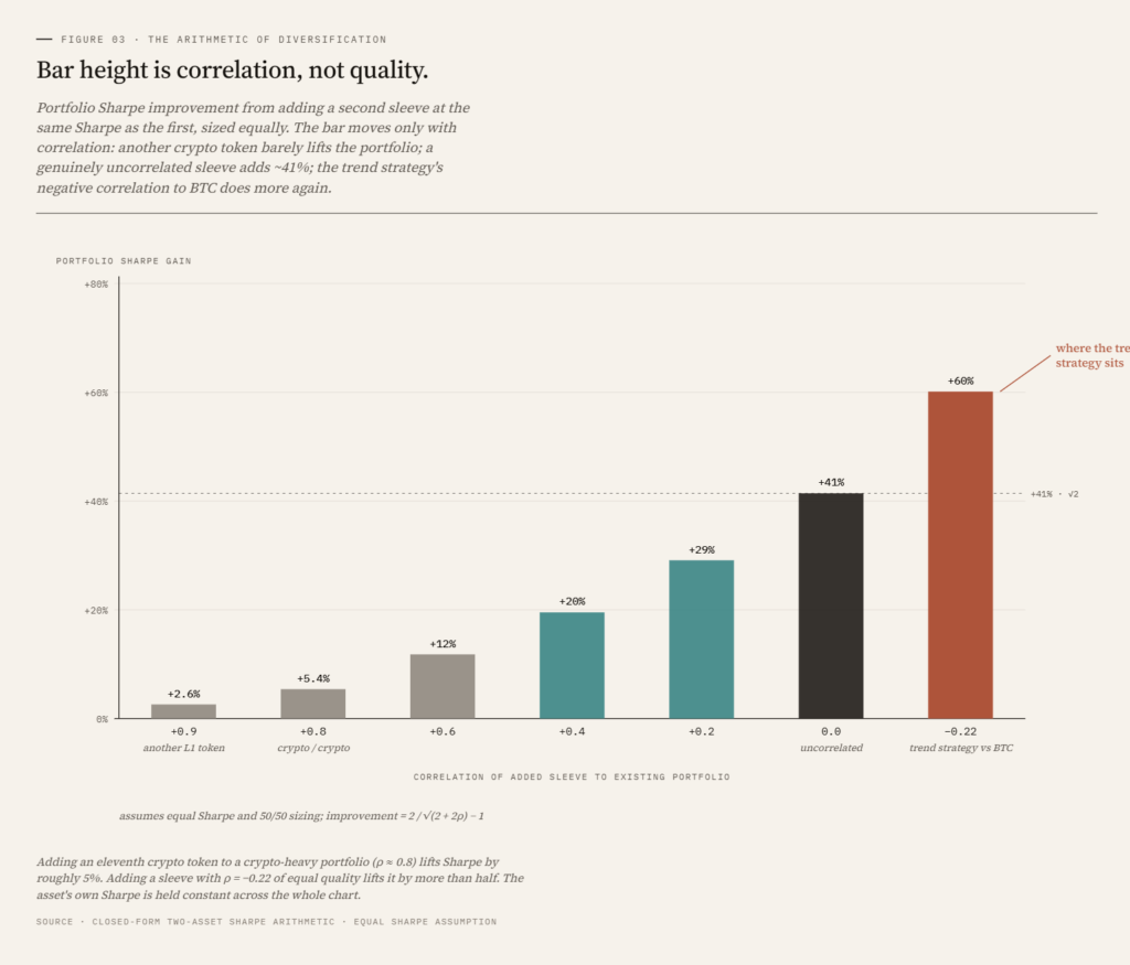
    This matters most for crypto natives, for a reason that is easy to miss. A portfolio holding BTC, ETH, an L1 or two and a basket of tokens feels diversified. It is not. Daily return correlations across major crypto assets, held outright, routinely sit between 0.7 and 0.9: when BTC sells off, the rest sell off with it. Ten correlated tokens behave, in risk terms, close to a single position, and the eleventh adds almost nothing. However many names it holds, a crypto-native portfolio is usually one bet.

    The arithmetic of diversification makes the point precise. Combine two assets of equal Sharpe and zero correlation, split evenly, and portfolio Sharpe rises by a factor of √2, a gain of 41%, because the volatilities partly offset while the returns still add. Correlation is what governs that gain. Run the same calculation on two assets correlated at 0.8, the crypto-to-crypto case, and the improvement collapses to about 5%. The correlation absorbs almost everything diversification would otherwise give you. This is why buying another token does so little.

    The trend-following strategy sits at the other end of that scale. Its backtested correlation to BTC is -0.22, below zero rather than near it, so the same arithmetic gives more than √2: close to 1.75x at equal Sharpe, and a reduction in drawdown rather than a dilution of return. For an investor who is 70% or more in crypto, this is the position that changes the portfolio. The first genuinely uncorrelated sleeve is worth more than every correlated token added after it.

    Takeaway: the diversification benefit comes from a different return profile, not another asset. Holding more crypto does not replicate it, however many tokens it is spread across.

    How Etesia runs the strategy

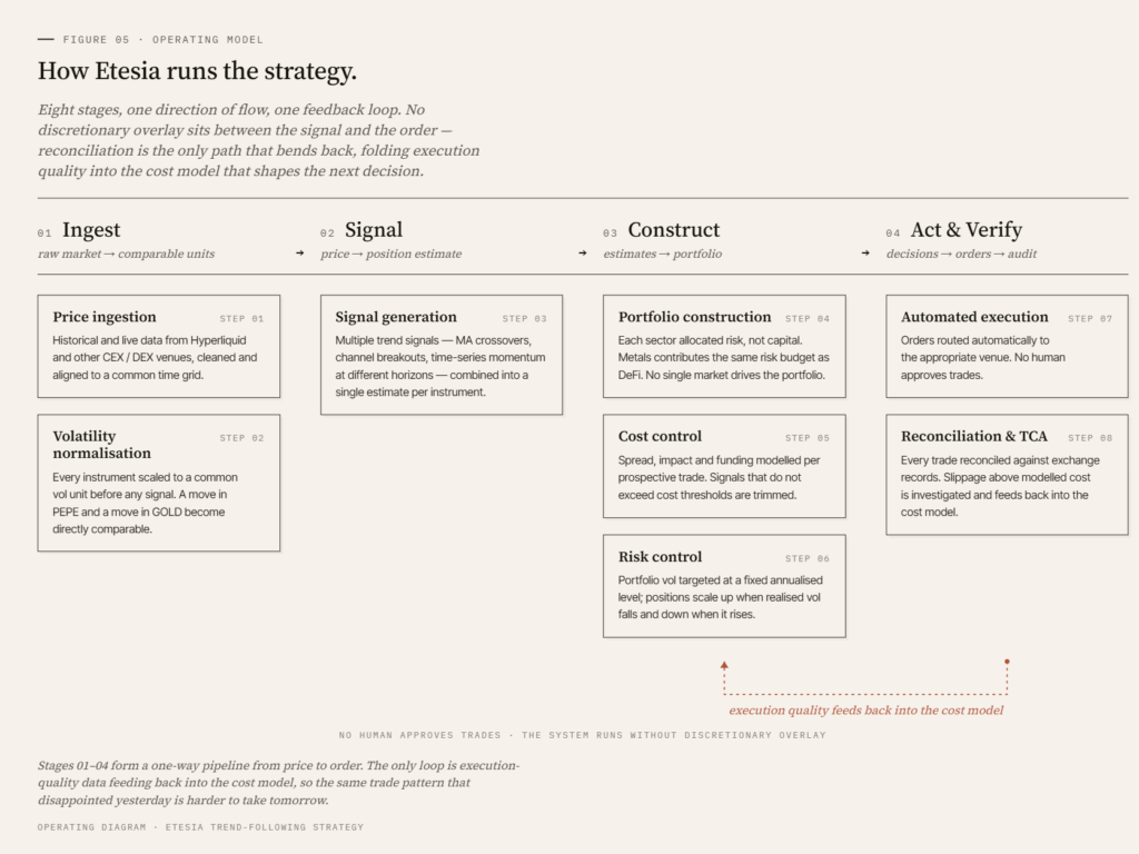
    The strategy operates on a universe of perpetual swaps across ten sectors: DeFi, Layer-1, Infrastructure, Meme, Payment, Store of Value, AI, Energy, Equity Indices and Metals. Three of those sectors (Energy, Equity Indices, Metals) are tokenised real-world assets. The remainder are crypto-native. Cross-sector daily return correlations are frequently below 0.2.

    The processing pipeline follows standard institutional CTA conventions, adapted for the crypto execution environment

    The full system runs without discretionary overlay. We do not override the signal because we have a view on the macro environment. The point of a systematic strategy is to harvest a statistical edge consistently across thousands of trades, not to be right about any one of them.

    Takeaway: the strategy follows institutional CTA conventions. The novelty is the universe (crypto plus tokenised RWA on perpetuals) and the execution stack (on-chain native), not the signal logic.

    What the strategy delivered in backtest

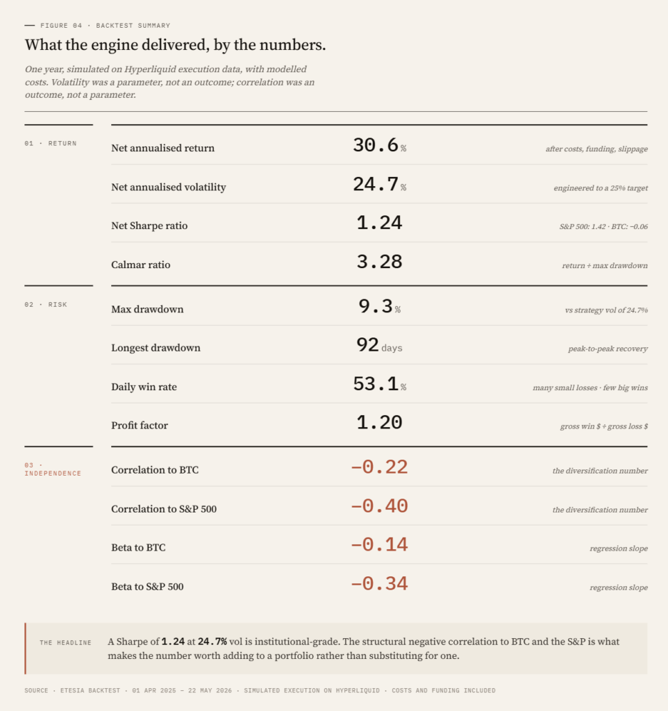
    For the period from April 2025 to April 2026, simulated on Hyperliquid execution data with realistic cost assumptions

    Sector contribution was concentrated in three areas: Metals (37% of PnL), Layer-1 (25%) and DeFi (17%). The remaining seven sectors contributed the balance. Highest sector Sharpe ratios were Metals (1.10), Layer-1 (0.90) and DeFi (0.76).

    The Sharpe ratio of 1.11 is the headline number for anyone who follows quantitative finance. What it means in plain terms, and how it compares to strategies most readers already know, is the subject of the next article in this series. Briefly: a Sharpe above 1 is considered good. Most discretionary hedge funds operate in the 0.3 to 0.7 range over multi-year periods. Over the same backtest window, BTC buy-and-hold produced a Sharpe of -0.03 and the S&P 500 produced 1.16.

    The 25% volatility is a parameter we choose, not an output. The strategy is built to deliver a fixed annualised volatility. We have set it at 20% to match the risk profile most crypto holders are already comfortable with. The same engine can run at 10% or 40%, with returns scaling roughly linearly. This trade-off between target volatility and expected return is the subject of the third article in the series.

    Takeaway: at our chosen risk budget, the backtest returned 30.6% with a 1.26 Sharpe and structural negative correlation to both crypto and equity benchmarks.

    Previous performances do not predict future performances

    This is a backtest. Backtests are not live performance. Costs are modelled with care, but live execution will reveal frictions that simulation cannot capture. We expect the live Sharpe to be lower than the simulated Sharpe. Anyone who tells you otherwise has not run live systematic strategies before.

    Trend following has bad years. The 2010s decade was difficult for most CTAs, with range-bound rates and commodity markets that produced few sustained trends. A strategy that targets fixed volatility will, by construction, take losses comparable to its volatility in any year that trends are absent. A 20% volatility strategy can lose 10% to 20% in a poor year without anything being wrong with the model.

    Our edge is not a signal nobody else has found. The edge sits in three places: a universe that few systematic teams trade today (RWA perpetuals next to crypto), an execution stack that runs natively on-chain, and the application of institutional risk discipline to a market where most participants run leveraged directional bets without it.

    Takeaway: expect a Sharpe near 1 over multi-year horizons, with single-year outcomes that can range widely. The strategy is designed to be held alongside other exposures, not as a standalone bet.

    Who this is for, and how to access it

    The strategy fits two profiles:

    – Holders of directional exposure (crypto, equity, gold) who want to reduce portfolio concentration without exiting their core positions.

    – Allocators with a dedicated alternatives bucket who want crypto-native systematic exposure delivered through institutional infrastructure.

    Access is through three channels:

    – Tokenised vault on Hyperliquid. Deposit and withdraw on-chain. ERC-4626/7540 compatible vaults are live and in pre-release.

    – Separately managed accounts. For larger allocators with custom mandates or reporting requirements.

    – Institutional platforms. Distribution partnerships are in progress.

    Etesia is non-custodial by design. Investor assets remain in on-chain vault structures at all times. No client capital flows through the corporate entity.

    *The next article in this series unpacks Sharpe ratio: what it measures, how to read it, and why a strategy with a Sharpe of 1 can still have a bad year. The one after that explains volatility targeting, and what it means to choose a risk level rather than try to forecast returns.*

    *Past performance and backtested results are not indicative of future results. Backtest results are based on simulated execution on Hyperliquid and include estimated trading costs and fees. Actual performance may differ materially. This article does not constitute an offer or solicitation to invest.*